Short answer
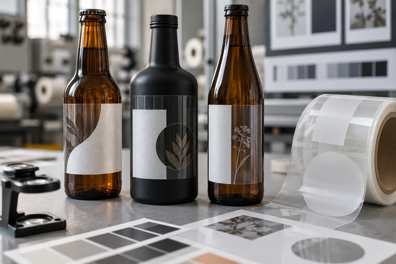
Clear labels on dark bottles usually need a white ink plan, not just a CMYK artwork file. Without white beneath them, inks behave more like colored glass than wall paint. The amber, black, green or blue package changes what the customer sees.
This is one of the easiest label mistakes to miss because the PDF proof is viewed on a white screen. The file can look bright while the printed result becomes quiet, brown or nearly invisible on the bottle.
What white ink actually does
White ink acts as an opaque foundation under selected artwork. A printer can place it behind a logo, nutrition text, a pale illustration or the entire color area. Clear regions remain transparent, while backed regions become more visible.
| White ink approach | Visual result | Best use |
|---|---|---|
| No white ink | Bottle color shows through all printed colors | Dark, intentionally subtle graphics or metallic-looking effects after testing |
| Spot white | Selected text and graphics become opaque | No-label designs that still need readable information |
| Flood white | Most artwork sits on an opaque panel | Stronger color while retaining a clear border or window |
| White BOPP instead | Consistent opaque base across the whole label | Small text, barcodes and predictable brand color |
A typical artwork problem: the logo survives, the details disappear
Consider a composite example: an amber beverage bottle with a clear front label. The logo is large and cream colored, the flavor line is pale green and the required copy is charcoal gray. On a white monitor, the hierarchy works. On amber glass, the cream warms, the green loses contrast and the gray copy becomes difficult to read.
The fix is not automatically "put white under everything." Spot white behind the logo and required text may preserve the transparent look. The green illustration might be left partially transparent if the brand wants the bottle color to influence it. This is where a deliberate white layer beats a generic clear-label request.
Clear film is a design system, not a material checkbox
- Dark containers: pale inks and thin lines need the most attention.
- Clear containers: the product color changes the artwork after filling.
- Textured or scuffed bottles: the surface may remain visible through the label.
- Barcodes: scanners need reliable contrast and quiet space.
- Front and back labels: artwork can visually interfere through a transparent bottle.
I once thought the cleanest no-label look meant printing as little white as possible. That is only true when the brand can afford subtlety. If a buyer needs a flavor name read in one second or a barcode scanned reliably in retail, opacity is not a design compromise. It is part of the function.
When white BOPP is the more honest choice
Clear film is attractive, but it is not automatically premium. White BOPP can be better when the artwork contains photography, light gradients, very small copy or critical color matching. It also removes the uncertainty created by changing product colors across flavors.
A dark bottle with a white label can look deliberate and confident. A clear label with unreadable copy only looks unfinished. The alternative deserves a fair win when reliability matters more than transparency.
Factory-side view
Approve the bottle, not the floating label
A digital proof checks size, spelling, dieline and layer logic. It cannot fully reproduce transparent ink on every container and product color.
For a high-visibility launch, request a printed sample or production-representative color proof and place it on a filled bottle under shelf lighting. The package is the final artwork.
Artwork checklist for clear labels with white ink
- Mark areas that must remain transparent.
- Create or clearly request the white underprint layer.
- Confirm whether white is spot or flood coverage.
- Keep small reversed text and thin lines within printer capability.
- Test barcodes on the final bottle color.
- Check front/back interference on transparent containers.
- Approve the label on a filled package, not only on a white backing sheet.
For a broader material comparison, see Clear BOPP vs White BOPP Labels. For print files, use the label artwork setup checklist.
Frequently asked questions
Do clear labels show on dark bottles?
They can, but unbacked colors and small text may become muted or hard to read because the dark bottle shows through. White ink can create opacity behind selected artwork.
What is a white ink underprint?
It is a white layer printed beneath selected colors or text on clear material. It blocks some of the container color so the artwork appears brighter and more predictable.
Should white ink cover the whole clear label?
Not necessarily. Spot white preserves transparent areas while supporting important text and graphics. Flood white creates a more opaque panel and may reduce the no-label effect.
Is white BOPP better than clear BOPP?
White BOPP is often better for maximum color consistency, fine text and barcodes. Clear BOPP is better when seeing the bottle or product is part of the design.
Related label guides
- Hot-Fill Bottle Labels: Heat, Timing and Adhesive Guide
- Labels for Squeeze Bottles: Prevent Creases and Edge Lift
- Kraft Paper Labels for Food Packaging: Best Uses and Limits
Test the specification before bulk production
Send the package photos, finished label size, quantity by artwork, storage conditions and application method. We will review the practical fit before preparing a quote and digital proof.