Short answer
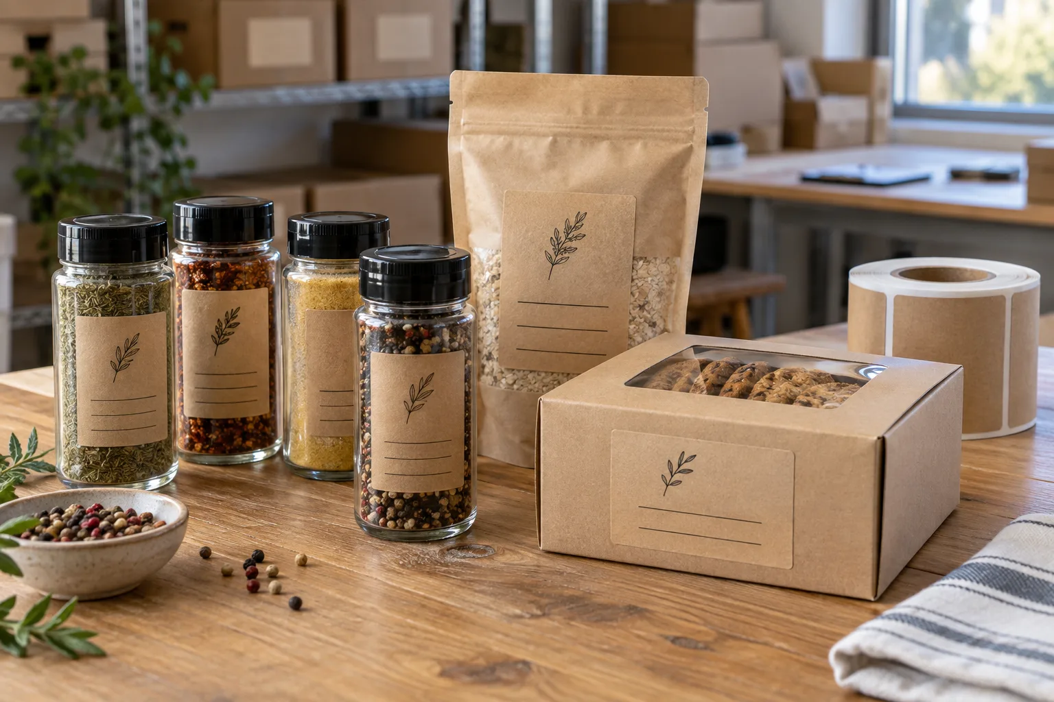
Kraft paper labels are best for dry packaging, stable storage and brands that genuinely benefit from a tactile brown-paper look. They are a poor default for chilled bottles, oily jars, wet hands or freezer use. Protective finishes help, but they do not turn ordinary kraft paper into film.
Buyers often ask for kraft because the brand is natural, organic or handmade. That visual logic is sound. The production question is whether the package lives in the same dry world as the mood board.
Where kraft labels earn their place
| Packaging use | Kraft fit | Reason |
|---|---|---|
| Bakery boxes | Strong | Dry surface, short use cycle and natural presentation |
| Spice jars and dry pantry goods | Strong with testing | Stable room-temperature handling |
| Coffee bags | Often suitable | Texture complements the category; bag surface still needs review |
| Honey or sauce jars | Conditional | Sticky or oily residue can stain paper |
| Chilled drinks | Weak | Condensation attacks face and edges |
| Frozen food | Usually weak | Moisture, frost and flexible packaging create multiple risks |
A typical brand conflict: natural look, refrigerated reality
Imagine a small cold-brew brand that wants uncoated brown kraft because it matches a craft market identity. That is a reasonable creative choice. The filled bottles then move from a refrigerator to a warm shop counter, and condensation forms directly across the label.
This is a composite decision example, not a claimed order. The brand has three honest options: accept visible paper aging as part of the look, move to a wet-strength specialty paper after testing, or print a kraft texture on moisture-resistant film. There is no material that delivers every advantage without a tradeoff.
Real kraft versus kraft-look film
| Factor | Real kraft paper | Kraft-look film |
|---|---|---|
| Touch | Natural fiber texture | Smoother and less authentic |
| Moisture | Absorbs and can darken | Better resistance with suitable construction |
| Color | Ink is influenced by brown stock | More predictable on a controlled printed base |
| Small text | Texture can reduce crispness | Usually cleaner |
| Brand signal | Strong handmade cue | Visual cue without the same tactile truth |
I do not think kraft-look film is dishonest when it is used openly as a visual treatment. It becomes a bad recommendation only when a buyer expects real paper texture and receives a smooth film without being told. Material language should be as clear as label copy.
Printing on brown stock changes the artwork
Brown kraft is not a neutral white canvas. Light colors lose brightness, photographs shift and fine details can soften in the fiber. Black line art, bold typography and limited color palettes often work better than pale gradients.
- Use strong contrast and avoid relying on very light CMYK colors.
- Ask whether white ink is available and how opaque it will be.
- Keep required copy comfortably readable.
- Expect natural variation in fiber and shade.
- Review barcode contrast on the actual stock.
Our view
Material should support the product story after purchase
Kraft can make a dry spice jar feel grounded and specific. The same kraft label, stained around an oily cap or curled on a cold bottle, tells a different story.
The most sustainable-looking option is not automatically the option that creates the least waste. A label that fails and forces repacking is not a visual success.
What to confirm before ordering kraft labels
- Package material and surface coating.
- Dry, refrigerated, frozen or humid storage.
- Possible oil, product residue or hand contact.
- Need for white ink, lamination or specialty finish.
- Barcode and small-text requirements.
- Whether authentic paper feel or durable kraft appearance matters more.
Compare the wider category in Paper vs Film Labels for Food Packaging. If the package is cold, also read the refrigerated food label material guide.
Frequently asked questions
Are kraft paper labels waterproof?
Standard kraft paper labels are not waterproof. Protective finishing can improve resistance, but exposed edges and a paper face still make them less suitable for repeated wet handling than film.
Can kraft labels be used on food jars?
Yes, especially on dry, clean jars stored at room temperature. For oily, refrigerated or condensation-prone jars, test carefully or consider a film construction.
Can white ink be printed on kraft paper?
White ink may be available depending on the printing process, but opacity and texture vary. A physical sample is useful when white details are important.
How can I get a kraft look on waterproof labels?
A kraft texture can be printed on white or clear film to create a brown-paper appearance with better moisture resistance. It will not feel exactly like uncoated kraft, but it can be the practical compromise.
Related label guides
- Hot-Fill Bottle Labels: Heat, Timing and Adhesive Guide
- Labels for Squeeze Bottles: Prevent Creases and Edge Lift
- Clear Labels on Dark Bottles: When White Ink Matters
Test the specification before bulk production
Send the package photos, finished label size, quantity by artwork, storage conditions and application method. We will review the practical fit before preparing a quote and digital proof.
Continue with Labels on Recycled Paperboard Cartons: Adhesion Starts with the Surface for a focused purchase checklist.
Continue with Bakery Paper Bag Labels: Plan for Grease, Folds and Handling for a focused purchase checklist.